CREATING A DYNAMIC WEBSITE THAT REFLECTS AN AGENCY’S TRUE BRAND EXPRESSION
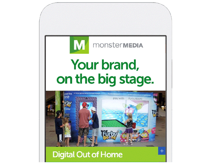
My client needed a website design to reflect their dynamic interactive design capabilities that they offered their clients. An important objective was to make information on mobile as accessible as the desktop version.
THE PREVIOUS WEBSITE DESIGN
The old website had a few challenges that were holding back the communication of the great work it was producing for it’s clients:
- The expression of the Monster Media brand was not prioritized
- Too many competing links distract from the messaging
- It was optimized for touch devices
- It felt too corporate for it’s brand archetype
THE WEBSITE REDESIGN CHALLENGE
The client has many different types of potential buyers in the advertising and media space with distinctly different needs.
THE APPROACH
The client and I discussed the main types of clients and I was able to narrow down the audience into four persona types:
- A – Fashion Brand Marketing Executive
- B – Director of Retail
- C – Media Buying Director
- D – Executive Creative Director
From here, I was able build out personas, dissect their needs, and address how the client is positioned to meet their needs and functions. That informed the process to design a website with the promise to exceed those needs.
MY ROLE
I was tasked with creating a touch and mobile first website design to visually represent the dynamic nature of Monster Media’s consulting and technology services. Additionally, I influenced information architecture and the user experience direction.
INFORMATION ARCHITECTURE
The personas informed the content architecture and flow. My personas were able to influence augmenting the original sitemap and user journey. Ultimately we revised the main navigation of the site.
of Home summary section
As lead designer, I created multiple wireframes based on the new site architecture. The design that performed most effectively and intuitively in tests with existing clients was chosen as the design direction.
THE NAVIGATION
When tapping on a menu bar item, the navigation swipes up to the top of the page to become a header and reveals the contents of the category page. The extraneous category headers get pushed to the top and come out the bottom. The natural gestures performed well for mobile and tablet experiences.
THE CHALLENGES
In the wireframing stage it became apparent we were going to need to visually help disseminate between the multitude of subcategory items. We decided to create a visual aid with icons.
THE EXECUTION
VISUAL DESIGN:
ICONOGRAPHY AND INFOGRAPHIC SYSTEM
As we began developing the site architecture, it became apparent that there Monster Media had many digital service offerings that required differentiation. A visual icon system helped distinguish the variety of offerings through cues that helped set the services apart from one another. The square icons are service location categories. The six-sided icons were analytics and security. The circular icons were technical interaction icons. See if you can identify the following icons: Digital Trucks, Mobile Control, Gestures, Multitouch, Sampling, and Augmented Reality.
HIGH-FIDELITY ANIMATED PROTOTYPES
In order to communicate the intentions of the animation design with stakeholders and developers, I created a detailed animated prototype that showed the motion and interactions of the navigation system.
THE RESULTS
We had a very smooth exchange with the developers building the site. Upon launch, Monster Media was able to curate and display case study videos on each product vertical that allowed them to grow their client base.
From shipping software to crafting experiences, I’ve been around the block
Here are some stories and case studies from my design experience:
A health tech platform that optimizes test kit delivery
My product design journey improving the the portal experience for patients and practitioners—driving results for end users.
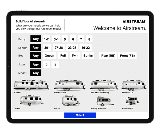
A tool to help customers select an Airstream model to fit their camp style
My journey through camper research, customer interviews, and leading the product design for a tool designed to increase consumer confidence.
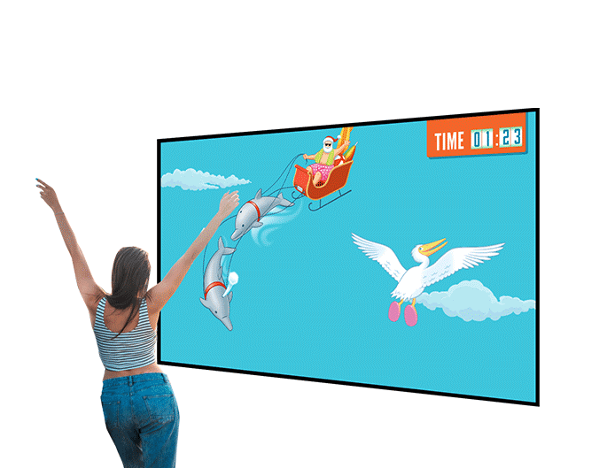
A gesture controlled experience where you fly like a bird for a chance to win a trip to Florida
My creative journey designing a game using user gestures to propel a bird through a journey from Chicago to Florida.
Auditing a real estate data Saas product to improve ecommerce
Improving an ecommerce user experience for a real estate data provider.
Mobile app and experience projects
A review of screen captures for a few mobile interaction design products that lead into comprehensive product design case studies.
Optimizing the product experience for a global auto parts brand
I was leading a rebrand of the 90 year old automotive brand and undertaking the direction of the desktop and mobile website redesign to achieve business and partnership goals.
Changing the way a global hospitality company creates interactive proposals
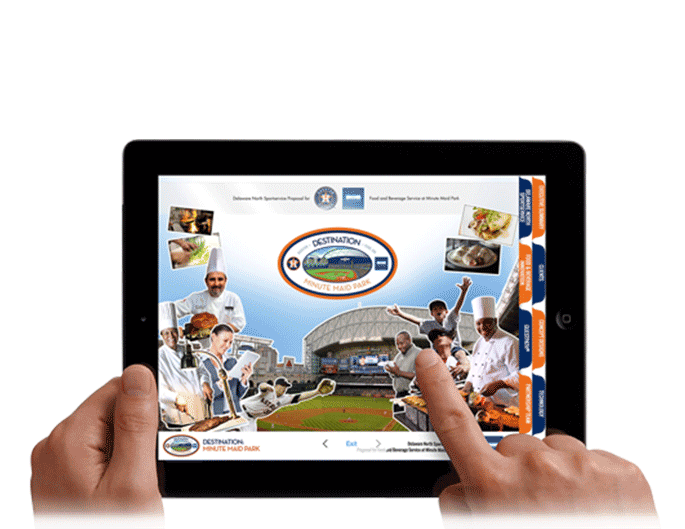
I brought to life a business pitch and proposal with interactive elements, sounds, videos and immersive experience that helped my client tell their story in a memorable way.
A pop up home experience that brings energy saving products to life
A case study that walks through the planning, design and execution for the traveling mobile exhibit that packs in four rooms of a household into a carefully designed, 5×5 foot space.
A dynamic website design to showcase an experiential agency’s digital capabilities
Working with Monster Media to reposition their digital, experiential and social media offerings to a diverse lineup of clients.
Designing a web3 platform to enable user access environmental conservation initiatives
Conserve Wildly is a mobile app platform designed to make it easy for allow citizens to vote on local conservation protection measures and proposals.
Matching volunteer’s talents with dog rescues that need their help
The Rescue Dogz app is a platform connecting skilled volunteers with nearby dog rescues that need their help.
Creating a buzz for a rebranded grocery chain in Florida
I interviewed customers in preparation for learning how to create an appropriate and immersive experience that celebrates Hispanic culture